When it comes to creating reports for a small group of audience within the organization, I always prefer Excel. I had a great learning experience preparing one such report recently. The thought of documenting the steps for future reference by me or anyone else has been strong in my mind from the day I finished that work, and now it is taking shape in the form of a blog.
About the Dataset
The dataset used for illustrating the workflow in this blog is obtained from kaggle (https://www.kaggle.com/pavansubhasht/ibm-hr-analytics-attrition-dataset). It is a fictional data set created by IBM data scientists to explore and analyze various parameters related to employees in an organization, thus uncovering the factors leading to employee attrition. It contains 35 attributes and 1470 records.
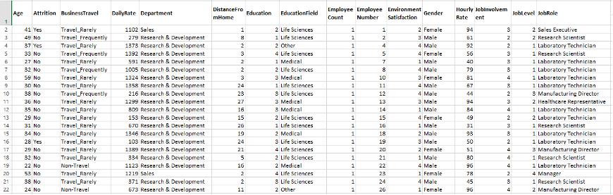
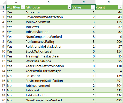
A snapshot of the dataset is given below. For a more detailed description of the dataset, kindly refer to the kaggle link mentioned above.
The distinct options for each of these attributes are as given below.
1. Attrition – Yes, No
2. Education – 1, 2, 3, 4, 5
3. EnvironmentSatisfaction – 1, 2,3, 4
4. JobInvolvement – 1, 2, 3, 4
5. JobLevel – 1, 2, 3, 4, 5
6. JobSatisfaction – 1, 2, 3, 4
7. NumCompaniesWorked – 0, 1, 2,3, 4, 5, 6, 7, 8, 9
8. PerformanceRating – 3, 4
9. RelationshipSatisfaction – 1,2, 3, 4
10. StockOptionLevel – 0, 1, 2, 3
11. TrainingTimesLastYear – 0, 1, 2, 3, 4, 5, 6
12. WorkLifeBalance – 1, 2, 3, 4
13. YearsSinceLastPromotion – 0, 1, 2, 3, 4, 5, 6, 7, 8, 9, 10, 11, 12,13, 14, 15
14. YearsWithCurrManager – 0, 1, 2, 3, 4, 5, 6, 7, 8, 9, 10, 11, 12, 13,14, 15, 16, 17
Process– 1: Create a Pivot Chart
To create a pivot chart that contains all the attributes together with the respective row counts for their distinct options, I followed the steps mentioned below.
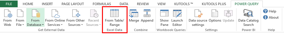
1. Click ‘From Table/Range’ button under ‘POWER QUERY’ tab. Query window opens.
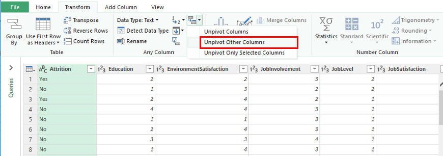
2. Select attribute ‘Attrition’ and click ‘Unpivot Other Columns’ option under ‘Transform’ tab in the query window.
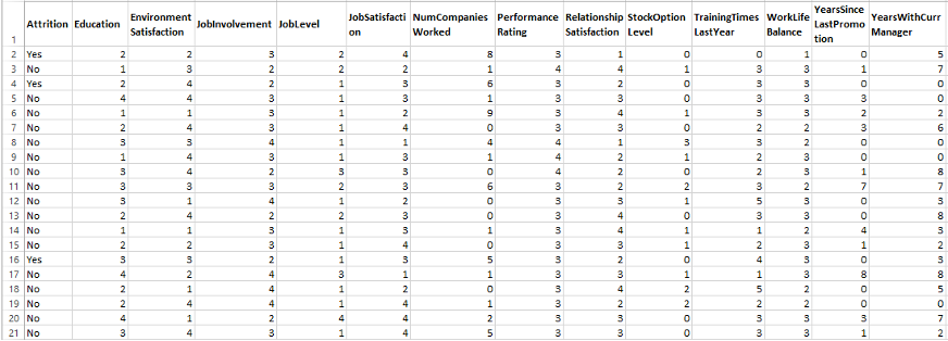
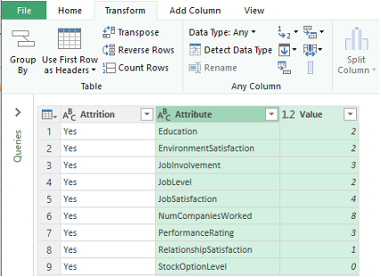
- All the attributes except 'Attrition’ are unpivoted as shown below.
4. Click‘Group By’ button under ‘Home’ tab and configure the ‘Group By’ window as shown below

5. Click ‘OK’, the window closes.
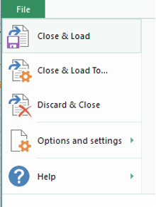
6. Click ‘Close & Load’ under ‘File’ menu
7. The query window closes and the processed data is displayed in a new sheet in the excel document.
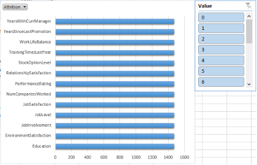
8. Now create a pivot chart with
a. ‘Attribute’ as the AxisCategory
b. ‘Sum of Count’ as Values
c. ‘Attrition’ as a Filter
d. Stacked Bar Chart as the ChartType
e. ‘Value’ as the slicer to slice the chart by different values such as 1, 2, 3…..
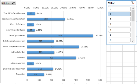
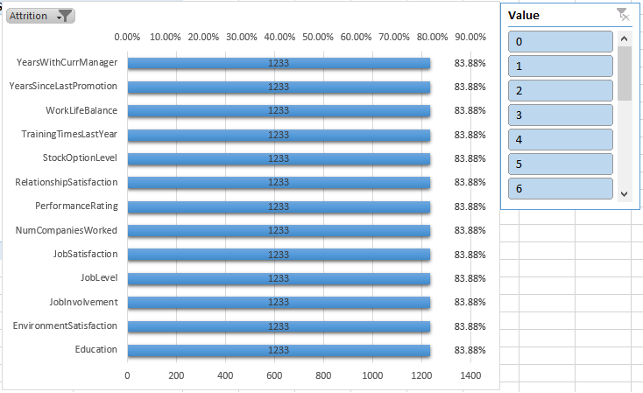
The chart will look as shown below when no slicers/filters applied.
Process– 2: Add a Second Set of Bars for Percentages
1. Click on the pivot chart, click ‘Field, Items & Sets’ button under ‘Analyze’ tab
2. Select ‘Calculated Field’ from the list that appears
3. Configure the Calculated Field window as shown below

4. Click ‘Add’ button
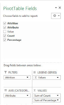
5. Add ‘Sum of Percentage’ as a second field under ‘Values’ in the pivot chart
6. Go to ‘Value Field Settings’ of ‘Sum of Percentage’ and change the Number Format to Percentage
7. Right click on the pivot chart and select ‘Format Chart Area’
8. Select Series ‘Sum of Percentage’ from ‘Format Chart Area’ window
9. Select Fill as 'No Fill', Border as ‘No line', Shadow as ‘No shadow’
10. Under ‘Series Options’ select ‘Secondary Axis' and adjust the ‘Gap Width’ to 300
11. Exit the format window
12. Click on the chart and enable Data Labels
13. Select ‘Center’ for ‘Sum of Count’ and ‘Outside End’ for ‘Sum of Percentage’ as positions of Data Labels
Below is how the chart will look when ‘No’ is selected from Attrition
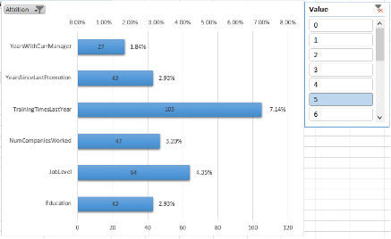
And here’s how it will look when slicers are applied.